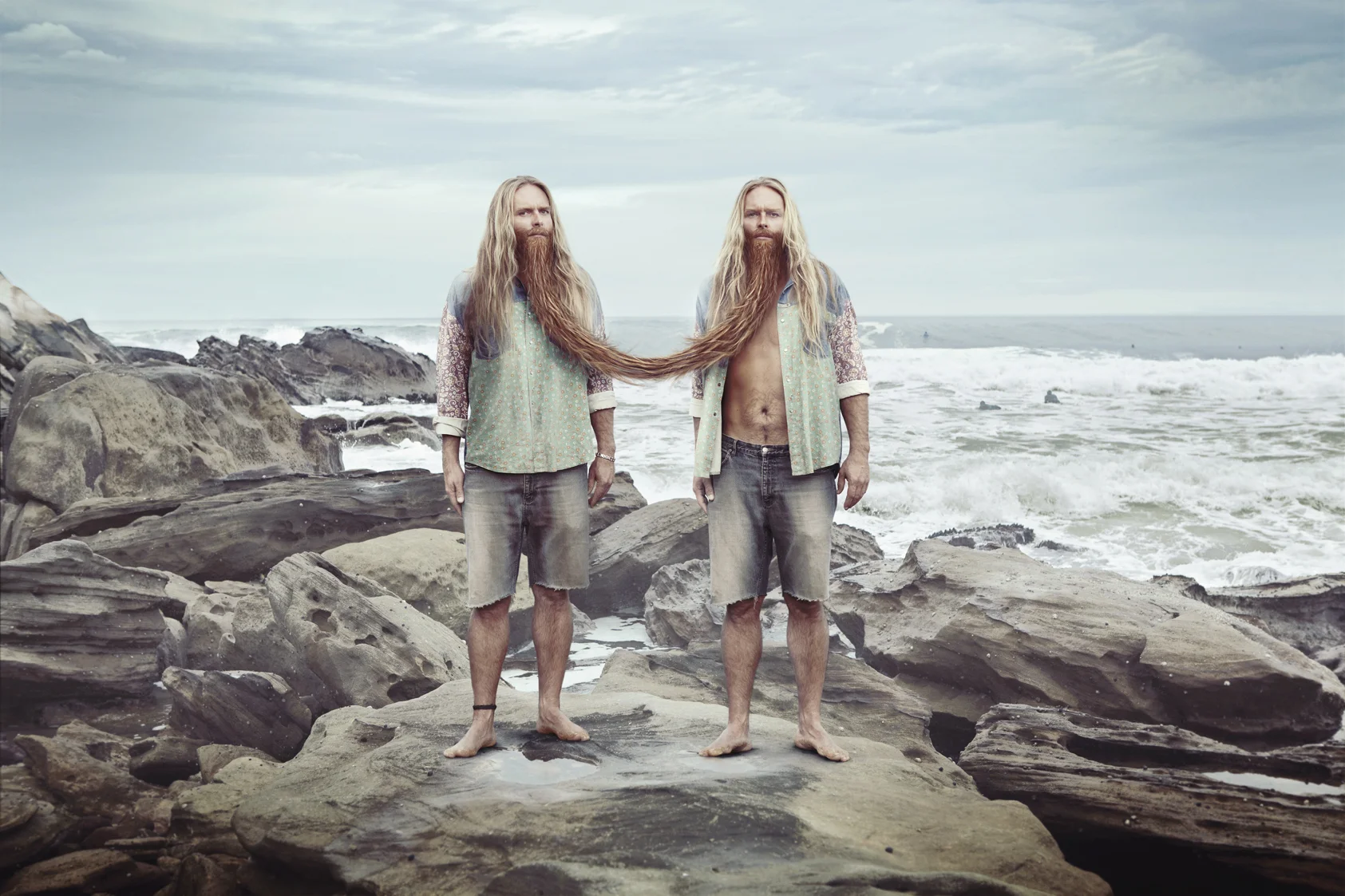
RMS is a small, independent surfboard shaper on the NSW Central Coast rich in craft, light on exposure. With no big sponsorships or high-budget media behind them, the challenge was simple: how do you earn attention from surfers without trying to shout like the big brands?
The answer came through The Bearded Twins - a playful, character-driven concept designed to reflect the one-on-one nature of working with a custom shaper. Built with humour and attitude, the characters gave RMS a human face, turning a single ad banner into a moment of connection rather than promotion.
More than a visual hook, the idea spoke directly to surfers who value individuality. It highlighted what RMS does best custom boards shaped around the rider, not the masses using a tone that felt relaxed, authentic, and rooted in surf culture.
Sweet tidbit. We shot it at the north end of Palm Beach. The twins were inspired by some old, quirky drawings Jonathan Palasty came across.
When the brief came through, Woolworths was in the middle of updating its overall look and feel - a moment of transition for a brand deeply embedded in everyday life. The task was to create a standalone TV campaign that would introduce and encourage people to embrace a new way of shopping, while reflecting this broader shift in how the brand presented itself.
The challenge was to communicate this change in style and approach in a way that felt engaging and easy to understand. It wasn’t just about announcing something new, but about making that change feel natural and inviting. The campaign needed to align seamlessly with Woolworths’ evolving brand identity, signalling progress without losing the sense of trust and familiarity customers already had.
At the same time, the work had to clearly highlight the benefits of the new shopping experience. Every element needed to resonate with the audience speaking to real needs, real habits, and real moments so the idea felt fresh and contemporary, yet unmistakably Woolworths.
Sweet tidbit. The idea of change in Jonathan Palasty’s mind came from listening to David Bowie's song Changes.
Nurofen has a wide range of products designed to treat different kinds of pain, from general aches to more specific conditions. Each one is created with a clear purpose, helping people find relief in the areas they need it most.
One of the most common types of pain is tension headaches. This is the kind of discomfort that builds when the muscles around your head, scalp, and neck tighten something that affects about 80% of people at some point. It’s persistent, distracting, and often hard to shake off.
Nurofen Zavance is specifically formulated to target this type of pain, easing the muscle tension around the scalp and neck where tension headaches usually begin. The challenge was to communicate this benefit in a way that was immediately understandable, visually striking, and memorable.
The illustrations bring this idea to life in a bold, metaphorical way. A figure is shown being wrapped by a slick, flowing octopus, its tentacles curling tightly around the head and neck. The grip of the tentacles instantly conveys the sensation of tension, making an invisible pain feel visible. The fluid movement of the octopus, combined with its exaggerated yet elegant form, gives the illustrations energy and drama, while still remaining playful and engaging.
In a single glance, the imagery communicates both the problem and the solution. The octopus represents the pressure and tightness of a tension headache, while the concept of Zavance suggests relief and release. It’s a creative, simple, and instantly recognisable way to show how the product works turning a common pain into something audiences can see, feel, and understand.
Sweet tidbit. The illustrations came from a graffiti artist in W.A.
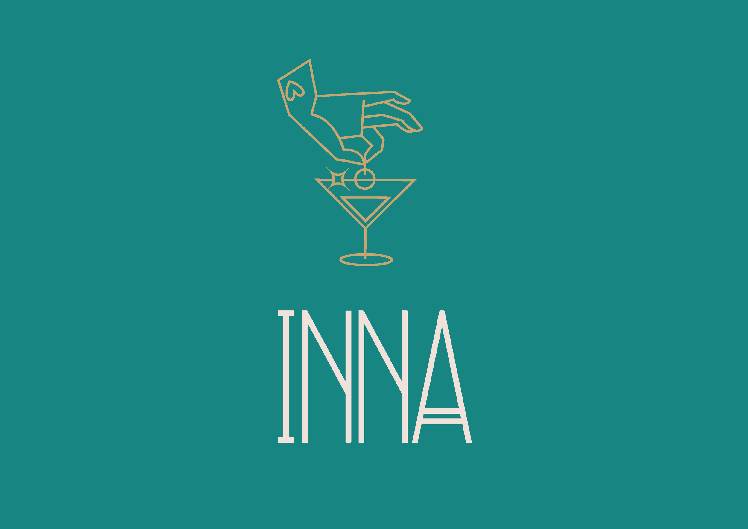
The Republic Hotel has reimagined its social heart by merging what were once separate lounge and dining areas into a single, lively destination spanning two floors. Now reborn with a fresh name and a striking new interior, this space invites guests to linger, explore, and enjoy every moment in an environment that feels both welcoming and distinctly elevated. From the ground up, the concept was about creating a place that works just as well for casual catch-ups as it does for vibrant dinners and stylish evenings out.
At the core of this transformation is the branding, which brings the Republic’s vision to life with a confident yet playful aesthetic. Classy, fun illustrations and clean, expressive lines weave together effortlessly, reflecting both the vibe of the venue and the broad range of experiences it offers. The visual language is modern without feeling cold, bold without losing warmth striking that perfect balance between sophistication and spirited charm.
What makes this project truly memorable are the unexpected combinations and the meticulous attention to execution. Every design choice, from the layout to the bespoke graphic elements, was thoughtfully considered to enhance the way people interact with the space. It’s not just about what’s on the menu or how a room looks, it’s about how it makes you feel: stylish, social, and unmistakably part of something uniquely Republic.
And there’s a delightful bit of inspiration behind the name itself. The team wanted something that echoed the same effortless cool as venues like “Nomad,” but with its own twist. “Inna” emerged as a playful nod to the idea of being insideThe Republic - a name that’s as inviting as the space it represents, hinting at both discovery and belonging from the moment you step through the door.
Sweet tidbit. The client wanted a name with a similar vibe to 'Nomad.' 'Inna' was a play on the idea of the spaces being inside The Republic."
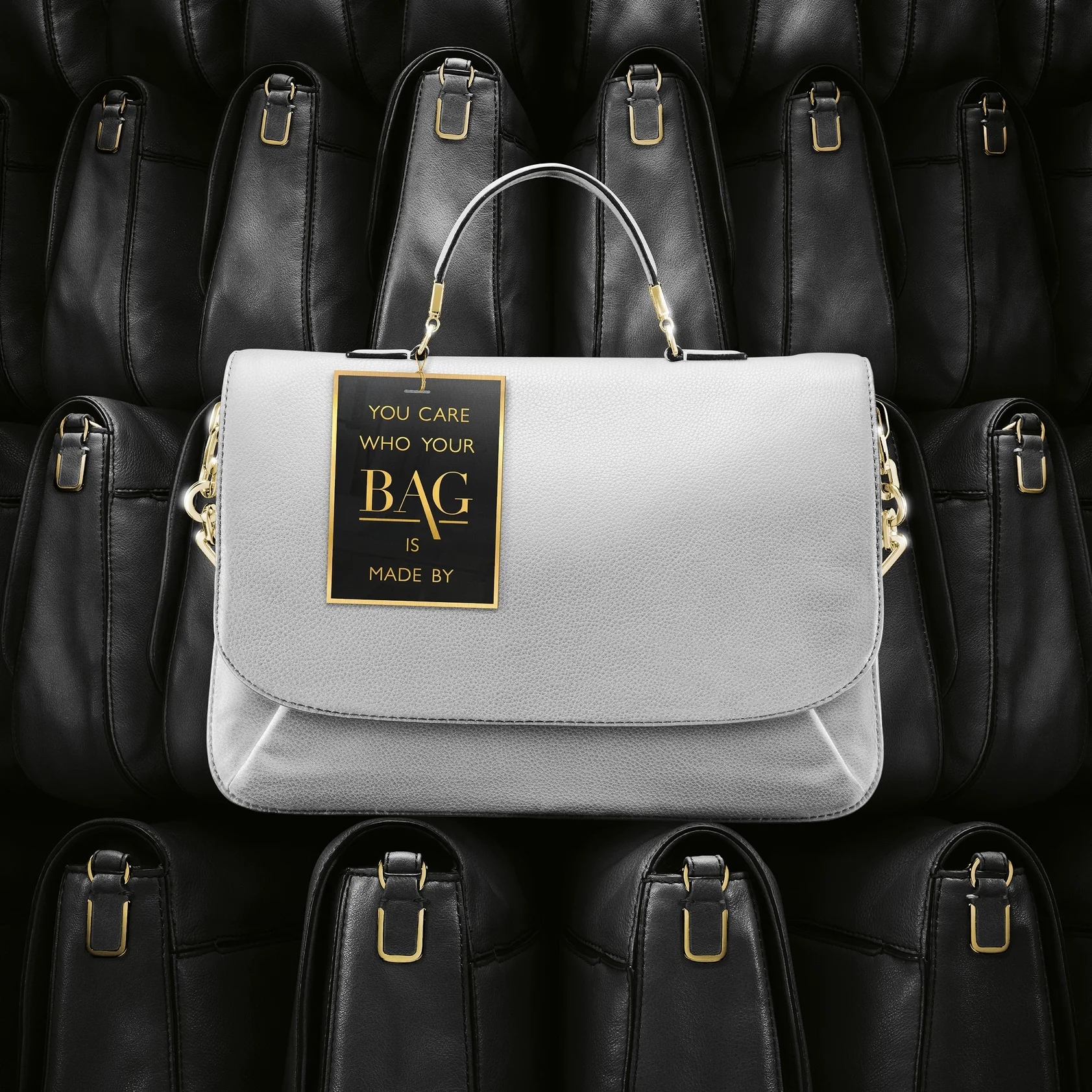
Botox is the original leader in anti-wrinkle therapy, but with cheaper options popping up, it’s important to show why Botox is still the top choice. The idea is to position Botox like high-fashion—something premium but totally attainable for those who want quality. Just like designer brands, Botox gives you trusted, lasting results without the gamble of newer, unproven alternatives. It’s the smart, reliable choice for anyone serious about looking their best.
Sweet tidbit. The backgrounds were inspired by geometric patterns. We shot the bag, but everything else was created with 3D programs.
The Adelphi Hotel is reimagining its Kitchen and Floor-Bar into a new lounge space with an art-inspired vibe. The interior takes cues from bold artistic styles, and the branding needs to match that energy. The idea is to draw on the Bauhaus design movement—known for its clean lines and geometric shapes—to create a modern, refined atmosphere that fits the Adelphi’s artistic, contemporary feel. It’s all about bringing together art and design in a fresh, stylish way for the hotel’s rebranded lounge.
Sweet tidbit: we had a crazy turnaround time, and the illustrator had to make several attempts to nail the style.
Alzheimer's Australia had a tight $30K budget to raise awareness about spotting early signs of Alzheimer's and starting conversations sooner. "The Forgotten Bag" taps into an emotional moment that will resonate with those experiencing early symptoms. By creating a powerful, moody ad, which stands out in the crowded TV space, delivering a strong message about the importance of early recognition and action.
Sweet tidbit. The music is original, inspired by the Danger Mouse track 'Her Hollow Ways.'
At the time, Woolworths was stuck with nothing but green backgrounds and a pretty tired in-store presence. With the Summer in-store campaign, we had the chance to shake things up and give it a fresh, bright look that really captured those summer vibes.
Nurofen is known for fast relief, but we need to make sure parents know Nurofen for Children works the fastest for their kids' fevers. The idea is to tell a fun, visual story that shows its quick action through a playful, childlike personality—making it clear that Nurofen for Children is the go-to choice for fast fever relief.
Sweet tidbit. We shot this in New Zealand using a local photographer and I somehow managed to score a free trip out of it, while also taking advantage of the NZD to cut production costs. Choice!
The Metamucil ad shows how it helps keep your insides healthy and balanced, turning your gut into a happy place. Simple, colorful, and all about feeling good.